
Most brand names die quietly. The name was fine, on paper. Pronounceable, trademark-able, the handle open on Instagram and the .com within budget. The founder said it out loud to a friend, the friend nodded, and the brand shipped. Two years later that brand is gone, or renamed, or it's the one a customer can never quite remember when they try to recommend it at a dinner party.
The name didn't die because the founder chose badly. It died because nearly every guide on how to name a brand aims at the wrong target, and the founder did exactly what the guide said.
Almost every guide points at the same thing. Pick a name that's memorable. Pick one your customers will remember, one that sounds good. Then it hands you a six-step process to get there. Define your brand, generate a longlist, run a trademark check, shortlist the finalists, test them, and pick one.
That process isn't wrong. It's just incomplete, in a way that costs brands more than they know. Fifty years of peer-reviewed research in psycholinguistics and consumer psychology points at a different target. The job of a brand name is to be polarizing. And the decisions that matter most happen at the level of sound, before the meaning of the word ever lands.
Acting on that research takes no six-figure agency, and no generator spitting out 200 made-up words.
What every guide on how to name a brand gets right, and where it stops
Spend an afternoon reading the top results for "how to name a brand" and the same article keeps coming back. The processes barely differ. Some run longer, some run shorter, but they all hit the same beats.
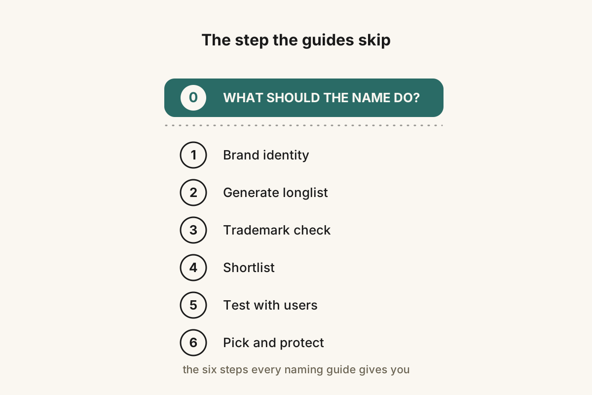
The standard six-step naming process skips the one question that should come first.
- Define your brand identity, mission, values, and audience.
- Generate a longlist using word association, compounding, and abstraction.
- Screen for trademark conflicts and domain availability.
- Narrow to a shortlist of finalists.
- Test with focus groups, surveys, or real-world exposure.
- Pick and protect.
This is fine as far as it goes. It's a reasonable scaffold for the visible half of naming, the part a founder can do with a whiteboard, a USPTO search, and a calendar invite to five customers. It catches the easy mistakes. It stops you from naming your skincare brand the same thing as an existing one in the same trademark class, and from picking a word that means something embarrassing in Portuguese.
The trouble is that this whole scaffold sits downstream of one question nobody on that first page of results ever asks out loud, which is what the name is actually supposed to do.
If the answer is "be memorable," then the generate-and-screen process fits. Memorability is mostly repetition and recognition. Most of those steps just check that a name is repeatable and recognizable enough to clear the floor.
But memorable turns out to be the wrong target.
What the research actually says
There's a small library of peer-reviewed research, going back nearly a hundred years, on how the brain processes a name. It almost never shows up in mainstream naming guides. When it does, it's one throwaway sentence, "hard consonants feel strong," with no citation under it. The real findings are sharper than that, and they point somewhere the conventional advice doesn't.
The findings that matter most start below the level of meaning, with the sounds themselves.
Sound symbolism, the sound of a name carries meaning before the word does
In 1929, the linguist Edward Sapir ran a study that became one of the foundational papers in psycholinguistics. He showed people pairs of nonsense words like mil and mal and asked which one meant a smaller table and which meant a larger table. More than 80% picked mil, the front vowel, for small, and mal, the back vowel, for large, and they did it across age groups. It wasn't a cultural habit and it wasn't specific to English. A front vowel reads as smaller, lighter, faster, and brighter almost everywhere someone has looked.
A few decades later, the gestalt psychologist Wolfgang Köhler ran the same idea with shapes instead of tables. He drew two figures, one all curves and one all spikes, and asked which was bouba and which was kiki. Ninety-five percent of people gave kiki to the spiky one. A 2022 study in Royal Society Open Science ran the test across 25 languages and the effect held.
That regularity is sound symbolism. Specific sounds carry specific connotations in the mind of the reader, before the meaning of the word is decoded, and it happens fast and without any effort on the reader's part.
So for naming, the sounds you choose are already telling a story about the brand before anyone reads the word. Klink published the consonant mappings in Marketing Letters in 2000. Four years later, Yorkston and Menon ran a now-famous experiment in the Journal of Consumer Research. They served the same ice cream to two groups and changed one thing, the name on it. One group got Frish, the other got Frosh. The Frosh group rated the ice cream creamier, smoother, and richer, and the only difference was the back vowel.
The practical takeaway is the set of phoneme-class associations. They aren't subtle, and they've been replicated enough that you can use them as a working map.
- Voiceless stops (p, t, k) sound sharp and decisive. They're why Pepsi snaps and Kodak clicks, and they fit a brand that wants to feel fast, modern, or precise.
- Voiced stops (b, d, g) sit heavier and read as more grounded and reliable. Think BMW, Dodge, and Google. They fit a brand that wants to feel substantial.
- Fricatives (s, f, v, z, sh) run smooth and fast, and they often read as luxurious. In a 2020 study of brand-name sounds in the International Journal of Market Research, Pathak, Calvert, and Lim found that fricatives track with luxury perceptions specifically. Sonos, Versace, and Visa all lean on them.
- Liquids (l, r) flow and soften. Allbirds and Lululemon use them to feel approachable, almost sensual.
- Nasals (m, n) come across warm, rounded, and intimate. Mailchimp and Notion use them to feel friendly and trustworthy.
This isn't a recipe. A name doesn't turn premium because you stack fricatives into it. The map just tells you what the sounds are doing in the background of the reader's head, so you can decide whether you want that background to match your positioning or push against it.
And if a name's sound profile fights what the category wants the buyer to feel, the name walks into the room with the wrong handshake.
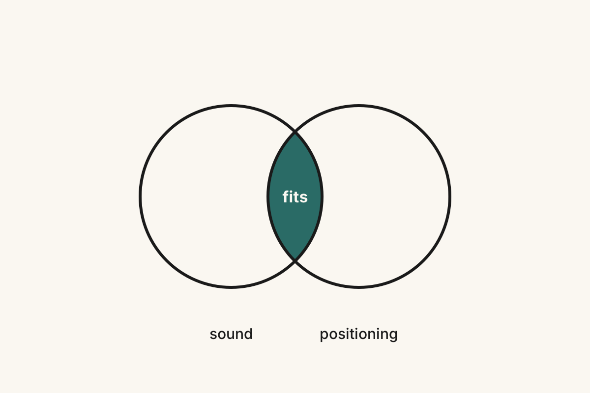
When a name's sound overlaps the positioning it has to carry, it fits. When the two fight, the name walks in with the wrong handshake.
Processing fluency, the brain reads easy as true
The second thread is processing fluency, which is just the ease with which the brain takes something in. The core finding comes from a 2004 review by Reber, Schwarz, and Winkielman in Personality and Social Psychology Review. The brain mistakes that ease for other things, for liking, for quality, for truth. When a thing feels easy to read, we tend to believe it, and when it feels hard, we tend to distrust it.
For names, that has a measurable consequence. In 2006, Alter and Oppenheimer published a study in the Proceedings of the National Academy of Sciences. Stocks with easy-to-pronounce ticker symbols outperformed stocks with hard-to-pronounce ones in the first weeks after their IPO. Investors were reading the pronounceable ticker as the safer bet, without knowing they were doing it.
Pronounceability isn't the only thing that drives fluency. Length matters too. Two to three syllables is the sweet spot for a consumer brand, and most of the names that stick land in that range. Familiar sound patterns help as well. A word that follows English phonotactics, the unspoken rules for which sound combinations are "allowed" in English, processes faster than a word that breaks them.
That's part of why a coined string like Xumo or Qwest can read as a little less trustworthy than a real English word used in an unexpected place. They make you decode them. Stripe doesn't.
Optimal incongruity, polarizing beats comfortable over time
The third thread is where the research turns the usual advice over. Consumer psychologists who study how people judge things that don't quite fit found that preference follows an inverted-U curve. In a 1989 Journal of Consumer Research study, Meyers-Levy and Tybout found that a moderately surprising product beat both the fully expected one and the wildly off-category one. Too familiar reads as boring, and too strange reads as too much. The peak sits in the middle, at optimal incongruity, an idea that traces back to the schema-congruity theory associated with George Mandler.
Put a name on that curve. A name everybody calls fine is sitting at the low-novelty end. It has cleared the bar for boring, but it hasn't done anything to earn attention. A name that some people love and other people hate is sitting closer to the peak, pulling a reaction from both sides. That reaction is what polarizing means.
Polarizing isn't the same as weird. A polarizing name takes a strong stance, in its sound or its meaning or both. Liquid Death is polarizing. It names a drink with the word death, exactly the move the category had spent decades avoiding. By 2024, Liquid Death had reached a $1.4 billion valuation. Pure Mountain Water Co. did not.
The opposite of polarizing isn't safe. The opposite of polarizing is forgettable. A name nobody reacts to is a name nobody remembers to buy.
Stack those findings and the target moves. A name has to take a stance strong enough to divide people, read easily enough to earn trust, and sound like what the brand is trying to be. The standard six-step process was never built to reach that.
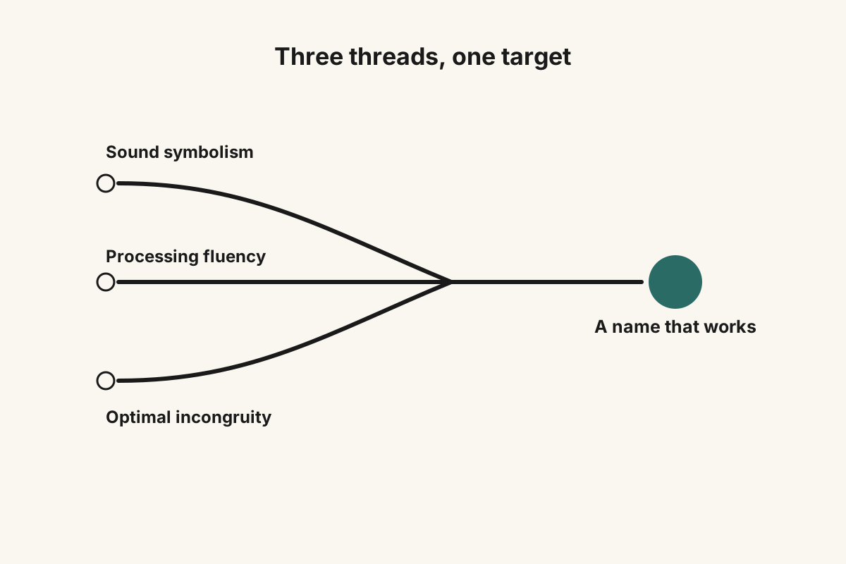
Three research threads, sound, fluency, and stance, resolve into one workable target for a name.
Anatomy of four working names
The fastest way to feel how the three threads work together is to take real names apart, sound by sound.
Stripe, the stop-liquid blueprint
Say it out loud. Stripe. Five phonemes pack into a single syllable. A fricative to open (the s), a stop (the t), and a liquid (the r), then one short bright vowel (the i), and a stop to close (the p, with the e silent).
The pattern is CCCVC, and it opens on a three-consonant cluster, the str-, one of the densest onsets English phonotactics allows. It's hard to say lazily. You have to commit to the str- to get it out, and that commitment is part of why the word lands sharp and decisive instead of soft or evasive.
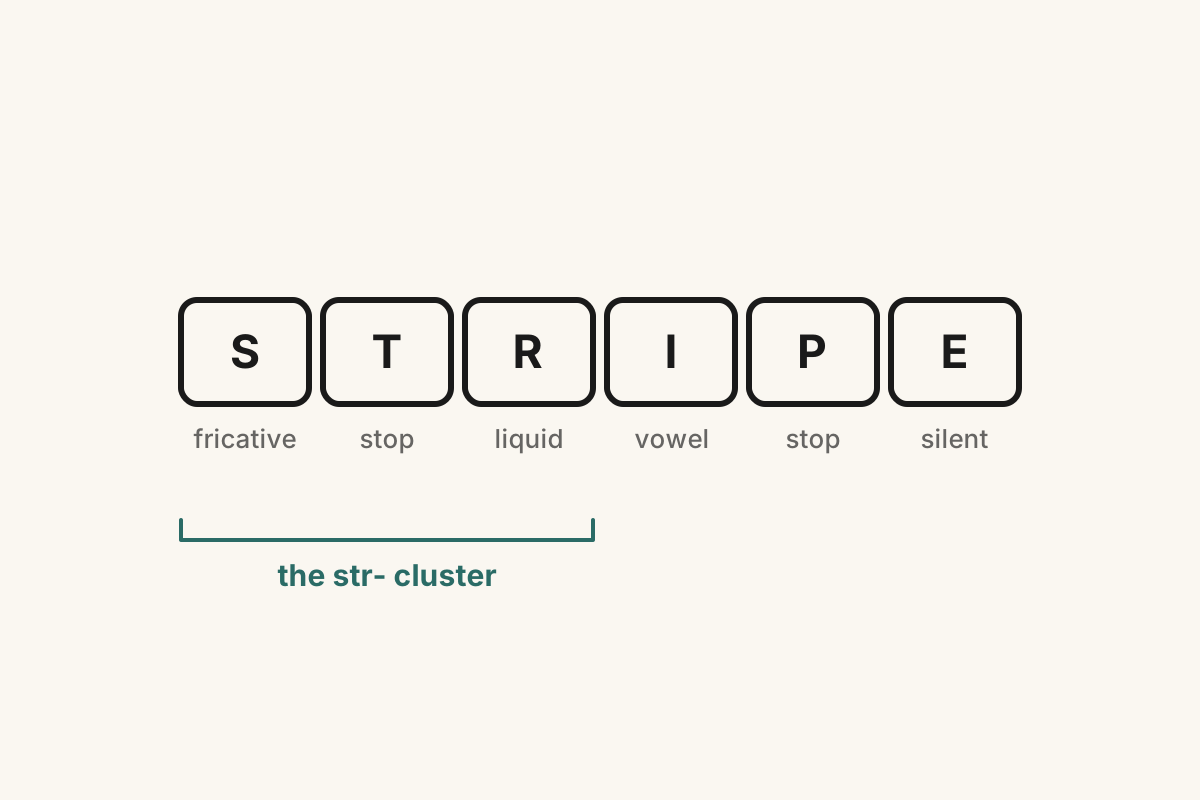
Stripe breaks into a hard opening cluster, one bright vowel, and a clean stop close. The sound is doing its work before the meaning arrives.
The meaning does work too. Stripe already lives in your vocabulary. You've seen stripes on a tie, on a road, on a credit card. So dropping it into "we charge cards with Stripe" doesn't ask the brain to decode anything new, it just lands, and that's processing fluency working in the background.
Set it beside the fintech wave that came after. Square closes softer and reads friendlier. Plaid is playful and less percussive. Mercury is mystical, three syllables of soft consonants. Ramp opens warm and feels less surgical. All good names, and none of them are Stripe. Stripe is the coldest, fastest, most decisive of the group, because that hard phonetic stack is exactly what a company that wants to feel like infrastructure needs.
Liquid Death, the optimal-incongruity stance
Liquid Death is the textbook case of polarizing beating memorable. The name breaks the convention beverage naming has followed for decades, the run toward freshness and purity and gentleness (Pure, Fresh, Crystal, Mountain, Spring). It takes the word death, with its hard, clipped th close, and pairs it with liquid, soft and liquid-heavy. The contrast is the whole point.
Under the sound, the name makes a deliberate anti-fluency move. Death is short, percussive, hard. Liquid is soft and flowing. The collision between the two is the whole brand. Mainstream water brands sand the edges off their names. Liquid Death sharpened them.
That's the incongruity curve made concrete. The name pushes far enough up the novelty end to grab attention, without tipping over into something nobody can parse. Plenty of people hated it at first. Plenty more loved it. Both reactions paid off the same way. Nobody who heard the name forgot it.
Olipop, a compound that tells you what it is
Olipop is soft sound symbolism done well. The stress falls on the first beat (OH-li-pop), and the name runs on liquids and stops in a friendly arrangement, the l and the p. It reads warm and round.
The real move is the compound. Oli- gestures at oligosaccharides, the prebiotic fibers the product is built around. -pop tells you it's a soda. That's what Wisniewski called conceptual combination back in 1996, where the brain reads two familiar fragments and fuses them into a third thing that didn't exist before. PowerBook does it (power plus book). DreamWorks does it (dream plus works). Olipop does it with a functional-ingredient cue and a category descriptor in a single word.
Set it against the rest of the category. Poppi runs a similar onomatopoeic move. Health-Ade leans on a heavy hyphenated compound. Culture Pop stacks two abstract nouns. Olipop wins on processing fluency, because the name is shorter, the syllables are cleaner, and the fusion of the two parts is easier to see through. You don't need anyone to tell you what Olipop does to make a fair guess.
Sonos, the palindrome with soft sibilants
Sonos is what restraint sounds like. Two syllables, a palindrome that reads the same forwards and backwards, opening and closing on the soft s. The profile is gentle the whole way through. A sibilant in, an open vowel, a nasal pivot, an open vowel, a sibilant out. Everything is rounded and balanced and ambient.
None of that is an accident. Sonos sells speakers built to disappear into a room, heard without being noticed. The name does the same job. Nothing in it is percussive, nothing demands attention. It carries the brand's whole positioning in five letters.
The palindrome is the flourish on top. The symmetry gives the brain a tidy shape to file away and pull back out. Civic, Honda's flagship sedan, runs the same trick at far larger scale.
All four names are deliberate. None of them is an accident of a founder liking how it sounded, and that is the difference between a name that carries the brand and a name the brand has to carry.
Two old ways to get there, and a third
Names like those four don't come out of the six-step guide, and a generator gets you further from them, not closer. Historically, only two things could get you there.
The first is a naming agency. The best of them, Lexicon, Interbrand, A Hundred Monkeys, Operative Words, charge between $50,000 and $250,000 for a single name and take three to six months. Their method looks a lot like what we just walked through, with extra layers of linguistic screening, trademark clearance, and stakeholder workshops on top. They're very good. They're also priced for Fortune 500 budgets, which is why the founders who need them most can almost never afford them.
The second is a random name generator. Namelix, Looka, Shopify's tool, and the long tail of AI wrappers that shipped in the last two years. These are good for exactly one thing, spitting out a high-volume longlist of made-up-sounding words. For everything that comes after, they're useless. A generator has no read on your category. It carries no model of sound symbolism, and no sense of where a name lands on the incongruity curve. It has a word list and a thesaurus. Most of what it hands back sounds vaguely tech-startup-y, because that's what its training data rewards, and none of it is native to your subcategory.
The third path takes that same method and runs it at a price a founder can actually reach. It works the research above as a repeatable process instead of a one-off flash of taste. It starts from the brief, weighs each name's sound against the positioning, checks how easily the name reads, and holds every candidate up against the real brands it would share a category with. What comes back is not 200 made-up words. It's a short list of names with the reasoning written beside each one, ready to hand to a trademark attorney. That is what BrandNames does.
This guide isn't the sales pitch. It's the public layer of the method, and most of what we just walked through, you can run yourself.
What to do Monday morning
If you've got a shortlist of names in front of you right now, run these five tests before you book a single focus group.
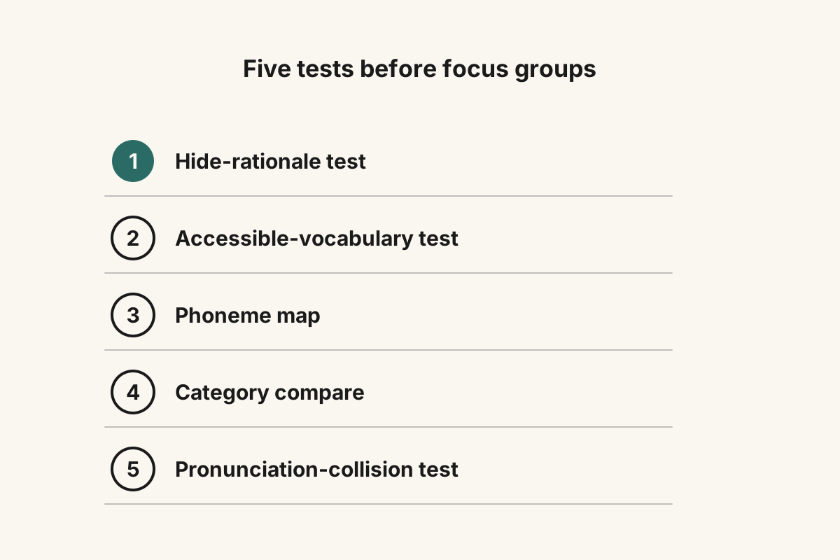
Five tests you can run Monday morning, before you spend a dollar on focus groups.
1. The hide-rationale test. Write your top three names on a piece of paper and hide everything else, the explanation, the story, the reasoning. Show just the names to a stranger and ask who they think the brand is for. Give them one or two guesses. If they can't get close in two tries, the rationale is doing the work the name should be doing, so cut the name.
2. The accessible-vocabulary test. Look at each name. Is every word in it already sitting in the buyer's head, or would they have to look one up? The interest should come from how the words connect, not from how obscure any single word is. If a customer needs Google to decode the name, the name is failing them.
3. The phoneme map. Write each name out sound by sound. Count the consonants and sort them into stops, fricatives, liquids, and nasals. Look at the vowels and mark them front, mid, or back. Now ask whether that sound profile matches the positioning. A premium yoga brand shouldn't sound like a kitchen knife, and a surgical software product shouldn't sound like a candle.
4. The category compare. Pull up the websites of your three closest competitors and read your name on the same line as theirs. Does it sound like a clone of the category, or like a counter to it? If it blends in, it loses. If it takes a clear stance against the others, in its sound or its meaning, it has a chance.
5. The pronunciation-collision test. Say the name out loud, fast, inside a sentence, "I work at ___." Then say it again at half speed. Then say it right after a brand you compete with. If the two run together, if a customer hearing it in a podcast ad would mishear it as something else, or if it drops sounds when you say it naturally, you've got a fluency problem the spec sheet will never catch. Founders skip this one because their own name has been said correctly inside their own head ten thousand times. The buyer is hearing it for the first time, in noise, at speed.
These five tests won't hand you a Stripe-grade name on the first pass. What they'll do is rule out the names that were going to fail anyway, and surface the one or two worth pressure-testing further. That's the work. The rest is patience.
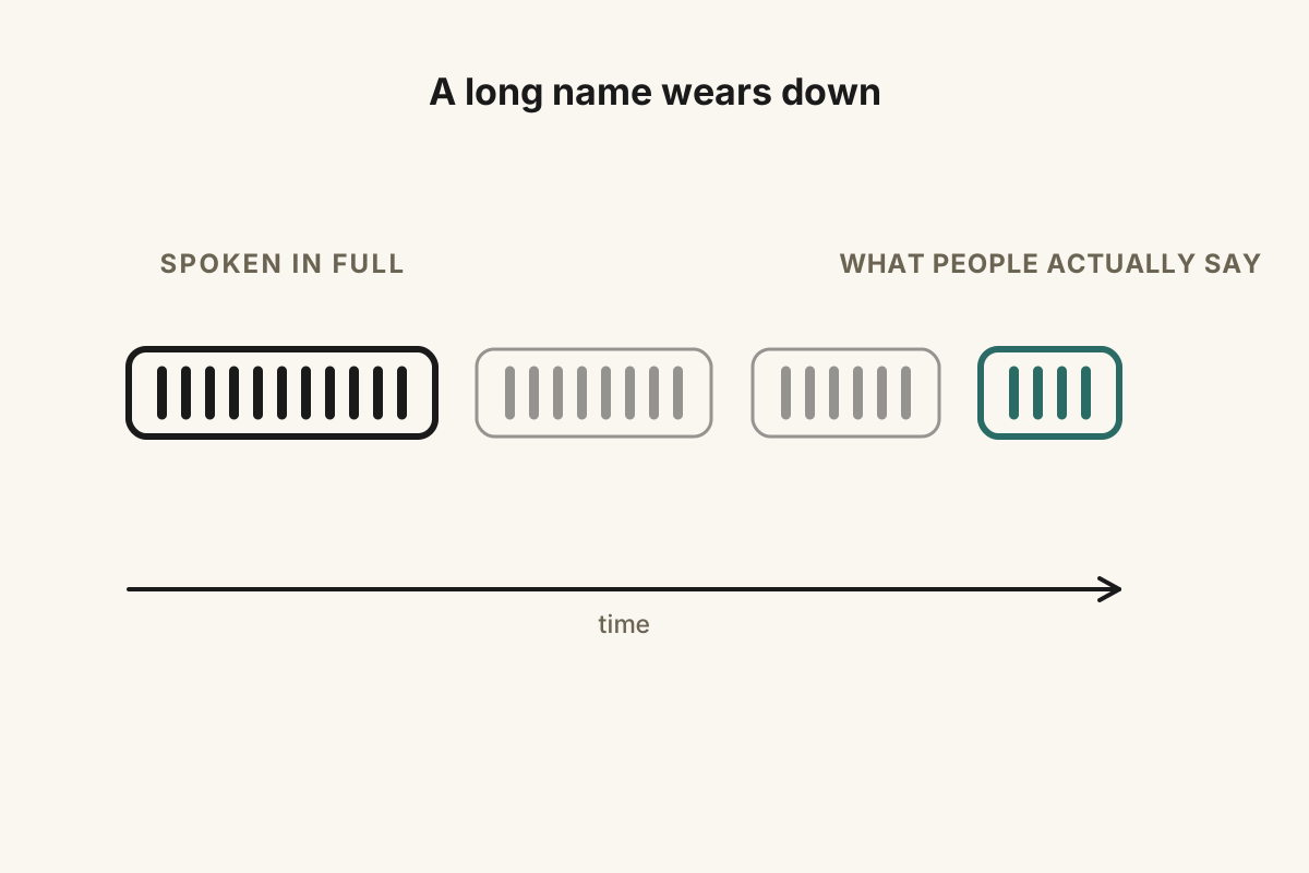
Long names wear down to the form people actually say, the way Coca-Cola becomes Coke and Federal Express becomes FedEx.
Frequently asked questions
What actually makes a brand name work, in linguistic terms?
A working name pulls three levers at once. Its sounds carry associations that fit the category instead of fighting it. It reads fluently, so a first-time reader trusts it without effort. And it takes a stance sharp enough to claim attention instead of blending in. The evidence sits in the peer-reviewed work on sound symbolism (Sapir 1929, Klink 2000, Yorkston and Menon 2004) and processing fluency (Reber, Schwarz, and Winkielman 2004, Alter and Oppenheimer 2006).
Is a memorable name better than a polarizing one?
Polarizing wins, and it isn't close. Attention comes first, and attention only shows up when a name takes a side. Research on optimal incongruity maps preference as an inverted-U curve. Too familiar reads as boring, too novel reads as too much, and the peak sits in the polarizing middle (Meyers-Levy and Tybout, Journal of Consumer Research, 1989). A name everyone agrees is fine has, by that logic, earned no attention worth keeping.
Is there a right length or syllable count for a brand name?
Two to three syllables is the sweet spot for a consumer brand, and most names that stick land in that range. Longer names wear down in everyday speech anyway, which is how Coca-Cola becomes Coke and Federal Express becomes FedEx. Length should track the energy of the positioning. One hard syllable feels surgical, the way Stripe /straɪp/ and Square do. Rounder names like Olipop and Sonos feel friendly, and longer, softer ones like Mercury and Patagonia can feel a little mystical. Length is a tool, not a target.
Do AI name generators actually help?
They do one narrow job well, producing a high-volume longlist of made-up-sounding words to start from. Past that, they stall. A generator has no theory of category-specific sound symbolism, no model of the category you'll compete in, and no way to judge whether a name takes the right stance. Most of the output sounds vaguely tech-startup-y, because that's what the training data rewards. Treat whatever it gives you as raw material, and run the five Monday-morning tests on the survivors.
Is sound symbolism real, or is it pseudoscience?
It's one of the most replicated findings in psycholinguistics. Sapir's 1929 study on front-vowel and back-vowel size associations has reproduced across age groups, cultures, and languages. The bouba/kiki effect (Köhler first ran it in 1929, Ramachandran and Hubbard named it in 2001) held up in 2022 across 25 languages in Royal Society Open Science. The consumer-brand application has its own literature, anchored by Yorkston and Menon's 2004 paper on phonetic effects on judgment. How strong the effect runs depends on context, but that it exists isn't contested in the field.
How do I check whether a name is trademark-safe?
Start with a free preliminary search. Use the USPTO's TESS database (the Trademark Electronic Search System) for the US and the WIPO Global Brand Database for international coverage. Search your exact name plus phonetically close variants inside the relevant trademark class, the goods-or-services class your business falls under, for example Class 3 for cosmetics or Class 25 for apparel. Once you have a finalist, hire a trademark attorney for a full clearance opinion before you spend a dollar on a logo or a domain. The free databases catch the obvious conflicts, but they miss the close phonetic neighbors that still get applications rejected.
BrandNames is an applied-linguistics naming method for founders. We're opening early access soon. Drop your email and we'll write you once, when the doors open.